

Ecommerce Site UX Problems That Are Killing Your Conversions

A lot of ecommerce stores lose sales in very ordinary ways.
The product is good. The ad worked. The traffic arrives. The shopper clicks around, adds something to cart, maybe even starts checkout. Then the sale disappears. No dramatic error. No site crash. No obvious disaster. Just enough friction to make the buyer leave.
That is what bad ecommerce UX looks like most of the time.

It is rarely one huge issue. It is a pile of smaller frustrations. Weak navigation. Thin product information. awkward mobile flow. Poor cart logic. Too many steps at checkout. None of them feel catastrophic in isolation. Together, they quietly drag conversion down.
Here are the ecommerce UX problems that still do the most damage.

Poor Navigation Creates Early Confusion
If the customer cannot work out where to go, the store starts losing momentum straight away.
This still happens on plenty of ecommerce sites. Collections are unclear. Menus are bloated. Product categories overlap. Important sections are buried. Filters are weak or missing. The shopper ends up doing extra work just to move around the store.
That frustration shows up early.
A strong store should feel easy to browse. The customer should understand what the business sells, how the catalogue is grouped, and how to narrow down quickly. If the structure is messy, people drift before they ever reach the buying stage.
This is connected closely to how to structure your website for SEO in 2026. Better structure helps Google, but it also helps shoppers. If the navigation is weak, rankings and conversions both suffer.
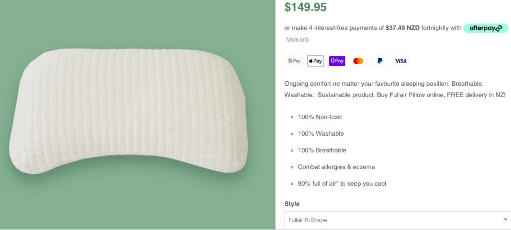
Thin Product Pages Do Not Build Enough Confidence
A lot of product pages still feel unfinished.
They show a picture, a price, a short description, and a button. That can work for simple, familiar products with low buying hesitation. It works far less often when the buyer needs a bit of reassurance before spending money.
A better product page should help answer obvious questions:
- what is it
- who is it for
- what makes it different
- what are the key details
- how fast can I get it
- can I trust this store
If the product copy is weak, the images are limited, or the details feel vague, the sale becomes fragile. The customer starts second-guessing. They may keep browsing. They may look somewhere else. They may leave and forget about it altogether.
A good product page should reduce uncertainty, not add to it.
Mobile UX Still Breaks Too Many Stores
This is still one of the most common weak spots.
A store can feel acceptable on desktop and frustrating on mobile. That is a problem because a big share of ecommerce traffic now lands through a phone. A lot of buyers will also finish the transaction there if the experience feels easy enough.
When mobile UX is poor, you tend to see:
- cramped product layouts
- weak image handling
- hard-to-tap buttons
- awkward filter use
- slow-loading sections
- checkout forms that feel annoying
That is usually enough to kill the purchase.
Speed is part of this too. A store that drags on mobile starts losing trust quickly. That is one reason why website speed matters for SEO and conversions. Poor performance chips away at confidence from the moment someone lands.

The Cart And Checkout Create Too Much Friction
A lot of stores do a decent job until the cart.
Then they make the customer work.
Unexpected shipping costs, weak guest checkout options, too many form fields, clunky payment flow, confusing progress, or poor mobile handling all make the sale feel heavier than it should. That is usually where conversion starts leaking.
A clean checkout should feel calm and direct. The customer should know what they are buying, how much it costs, what happens next, and how close they are to finishing. If the process feels uncertain or bloated, people pull back.
The same principle shows up in our design tips for a seamless ecommerce checkout. Reduce friction, keep the path obvious, and stop making the buyer think harder than they need to.
Trust Is Missing At The Wrong Moments
A lot of ecommerce stores leave trust too late.
The shopper adds something to the cart and only then starts looking for reassurance. Where is the returned information? Is shipping clear? Are payment options visible? Does this store feel established enough to hand money to?
If those answers are hard to find, hesitation grows.
Trust signals do not need to be loud to be useful. Clear delivery information, visible contact details, consistent branding, reviews, secure payment cues, and sensible return messaging all help. The store should feel stable and credible from the first click, not only at the end.
This is especially important for newer or smaller NZ stores that do not have big brand recognition doing the heavy lifting for them.

Search And Filtering Still Get Neglected
A shopper who wants something specific should not have to dig for it.
Search bars that return poor results, filters that are too limited, and collections that fail to narrow products properly all create frustration. This is one of those quiet UX problems that rarely gets dramatic attention, but it affects conversion hard when a catalogue grows.
If someone knows roughly what they want and the store does not help them find it quickly, the sale starts slipping.
This matters even more for larger stores or stores with several product types, sizes, colours, or use cases. Better UX here usually means stronger commercial performance without needing any extra traffic at all.

Too Much Effort Goes Into Looking Good And Too Little Into Buying Flow
A lot of ecommerce design work still puts appearance first and buying flow second.
The storefront looks polished. The homepage banner looks expensive. The imagery is strong. Then the buyer gets into the store and the practical parts feel undercooked. Navigation is fuzzy. Product info is thin. Checkout is awkward. Mobile experience drags.
That is the wrong balance.
A good-looking store helps. A store that makes buying easy helps far more. The best ecommerce UX usually feels clear, fast, and slightly boring in the right places. It does not force the customer to admire the design. It helps them buy with less effort.
That is part of what E-Commerce Website Design should solve. The store needs to support sales, not only appearance.

Better UX Usually Means Better Use Of Existing Traffic
A lot of ecommerce businesses assume they need more visitors.
Sometimes they do.
A lot of the time, they need a cleaner store.
If the site already gets product views, cart activity, or strong session numbers, the better commercial move may be to fix the UX problems that are slowing conversion down. Better product detail, better mobile handling, better navigation, smoother checkout, and stronger trust can shift revenue without having to increase traffic first.
That is one of the reasons ecommerce UX matters so much. It sits right in the middle of what the business is already paying to attract.
If the store feels harder to use than it should, conversion will keep leaking until the friction is dealt with. Clean that up, and the same traffic often becomes worth far more.
Talk to Kiwi Website Design Today.
You May Also Like
- Tip for Effective Product Description Writing
- E-Commerce Website Design Elements 2022
- Best Email Marketing Tips to Increase Engagement
Comments are closed.