

What Makes A Good Homepage In 2026 For NZ Service Businesses
A lot of service business homepages still try to do everything at once.
They try to explain the whole business, tell the brand story, list every service, squeeze in SEO terms, show trust signals, and push a call to action, all above the fold if possible. The result is usually a homepage that feels crowded, vague, or forgettable.
A good homepage in 2026 does not try to win by saying everything. It wins by making the right things clear, fast.
For NZ service businesses, that matters because the homepage is often the first real impression after someone finds you on Google, clicks through from a referral, or compares you against two or three local competitors. They are making quick decisions. Does this business look relevant? Do they work in my area? Do I trust them? Is it obvious what they do? Can I contact them easily?
If the homepage makes those answers hard to find, the website starts leaking value immediately.
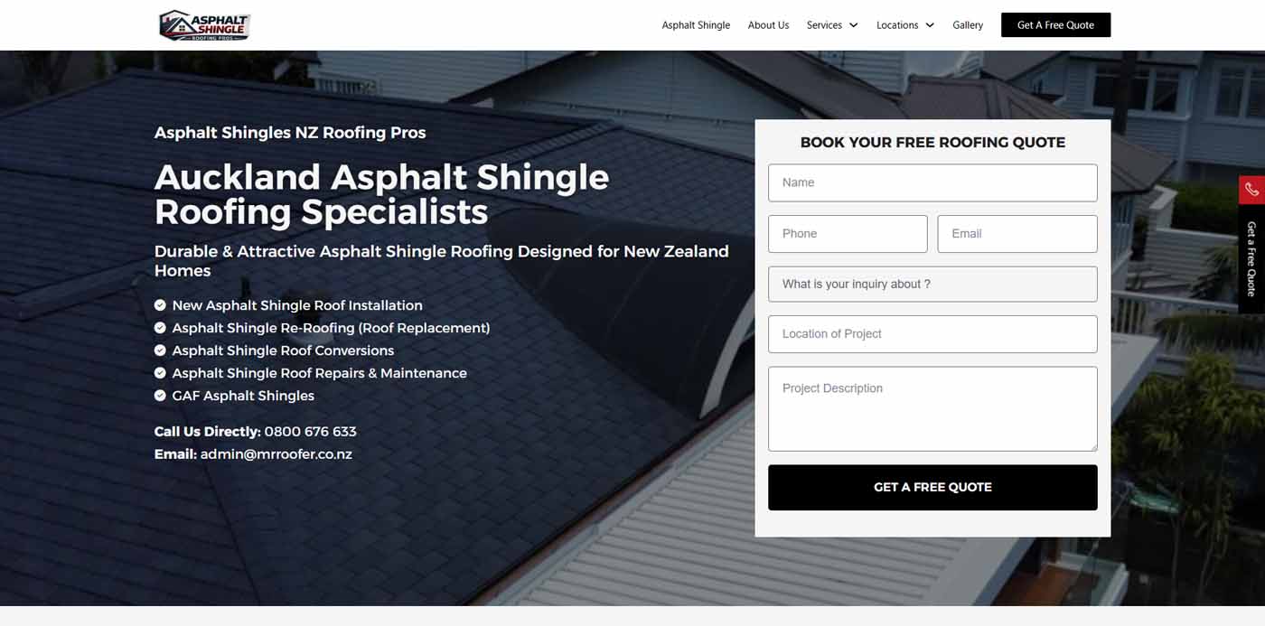
A Good Homepage Explains The Business Fast
The first job of the homepage is clarity.
A visitor should be able to land on it and quickly understand what the business does, who it helps, and where it operates. That sounds basic, but a lot of homepages still miss it. They open with vague slogans, broad branding language, or over-styled headings that look nice and say very little.
If someone lands on the site of an Auckland builder, accountant, or tradie, they should not have to decode the offer. The homepage should state it plainly.
That usually means the top section needs:
- a clear main heading
- a short supporting explanation
- a visible action point
- enough context to make the service feel real
A homepage does not need to be clever first. It needs to be clear first.
It Has To Feel Relevant To The Right Customer
A generic homepage tends to attract generic attention.
That is not very useful.
The stronger homepages usually feel like they were built for a specific kind of customer, even if the business serves a broad market. The wording, proof, and service flow all signal who the website is really for. That helps the right visitor settle in quickly.
For NZ service businesses, this can be as simple as making location and service relevance obvious early. If you work across Auckland, say that clearly. If you focus on commercial work rather than residential, say that clearly. If your process is different from competitors, make that difference easier to spot.
A homepage should help the right customer think, “This looks like the kind of business I was hoping to find.”
That is one reason strong website design in New Zealand has to be shaped around commercial fit rather than generic visual trends.
Trust Has To Show Up Early
Trust is one of the main jobs of the homepage.
A service business is usually asking someone to make a decision with some level of risk attached. That could mean time, money, disruption, reputation, or all four. If the homepage does not make the business feel credible quickly, the rest of the site has to work much harder.
That trust can come through a few different elements:
- clear service positioning
- years of experience if relevant
- reviews or testimonials
- recognisable client or supplier references
- project proof
- process clarity
- strong design quality
- contact details that make the business feel real
The key is not to dump all of it in a heap. The key is to place the right trust signals in the right places so the homepage feels steady and convincing without turning into a wall of badges and claims.
The Homepage Should Guide, Not Overwhelm
A lot of weak homepages have too many directions competing with each other.
Every button shouts for attention. Every section tries to be the most important one. The visitor gets hit with too many choices too early, and that usually slows them down.
A better homepage guides the next step.
That might be:
- view a key service
- request a quote
- call now
- book a consultation
- browse a collection
- read a case study
The right action depends on the business, but the homepage should make that route feel natural. If someone is ready to move, the site should help them do that. If they still need reassurance, the homepage should help them move into the proof or service detail that supports that decision.
This is one of the reasons why your website gets traffic but no enquiries. A lot of homepages get visits but fail to create momentum.
Service Businesses Need Strong Homepage Structure
A homepage should not try to rank for every possible keyword under the sun.
That approach usually creates clutter and weakens the user experience. A stronger homepage uses a clear hierarchy and lets the rest of the site do its share of the work.
For most service businesses, the homepage should support:
- the main business offer
- the core service groupings
- the main service area or location
- trust and proof
- the primary CTA
- a clean path into deeper service content
That is different from trying to cram the entire website into one scrolling experience.
The homepage introduces, reassures, and directs. The deeper service content closes the gaps. The location content sharpens local relevance. The blog content supports authority and search breadth. Everything has its place.
That is why understanding how to structure your website for SEO in 2026 matters so much for homepage planning too. If the whole site structure is weak, the homepage usually starts trying to compensate for everything.
Mobile Homepage UX Matters More Than Ever
A homepage that feels good on desktop can still fail badly on a phone.
That is still one of the easiest ways for service businesses to lose trust. If the mobile homepage is hard to scan, slow to load, cluttered, or awkward to navigate, the first impression weakens fast. Plenty of people will hit your site on mobile first, especially from local search.
The mobile version should still make the essentials obvious:
- what you do
- where you work
- why trust you
- how to contact you
If users have to dig for the basic answers, the homepage is doing too much or saying things in the wrong order.
Strong web design auckland projects usually feel cleaner on mobile because the content hierarchy has been thought through properly before the layout is styled up.
The Copy Has To Sound Human
A homepage full of generic phrases usually underperforms.
Most people can feel when the copy says a lot without saying much. “High quality service.” “Tailored solutions.” “Customer-focused approach.” None of that helps much on its own. It sounds safe, but it is weak.
A better homepage sounds like a real business with a clear offer and a clear understanding of its customers. The wording should feel practical and grounded. It should reflect how the business speaks and what matters commercially.
That does not mean writing casually for the sake of it. It means avoiding filler and saying the useful thing first.
For KWD-style service websites, that usually means speaking in direct business terms rather than over-branding the message.
A Good Homepage Supports SEO Without Feeling Written For SEO
A homepage still needs to be useful for search, but that should not dominate the writing.
You want the main topic, location relevance, and service direction to be clear. You want the metadata right. You want internal links into the important service areas. You want Google to understand what the business is about.
But the homepage should still read like it was built for humans.
That is often the balance that separates a strong homepage from a weak one. It supports SEO in a sensible way, without sounding like it was written for a search engine first and a person second.
It Should Make The Business Feel Easier To Choose
That is probably the best test of all.
A good homepage makes the next decision easier.
It does not need to answer every question. It does need to make the business feel clearer, more relevant, and easier to trust than it did thirty seconds earlier. If it can do that while guiding the visitor into the right next step, it is doing its job.
For NZ service businesses in 2026, a good homepage is less about showing off and more about reducing friction. Clear offer. Strong trust. Smart structure. Good mobile flow. Obvious next steps. Human copy.
Get those things right and the homepage stops being a warm-up act. It becomes one of the strongest commercial parts of the whole website.
Comments are closed.